Teacher Resources on sfmoma.org
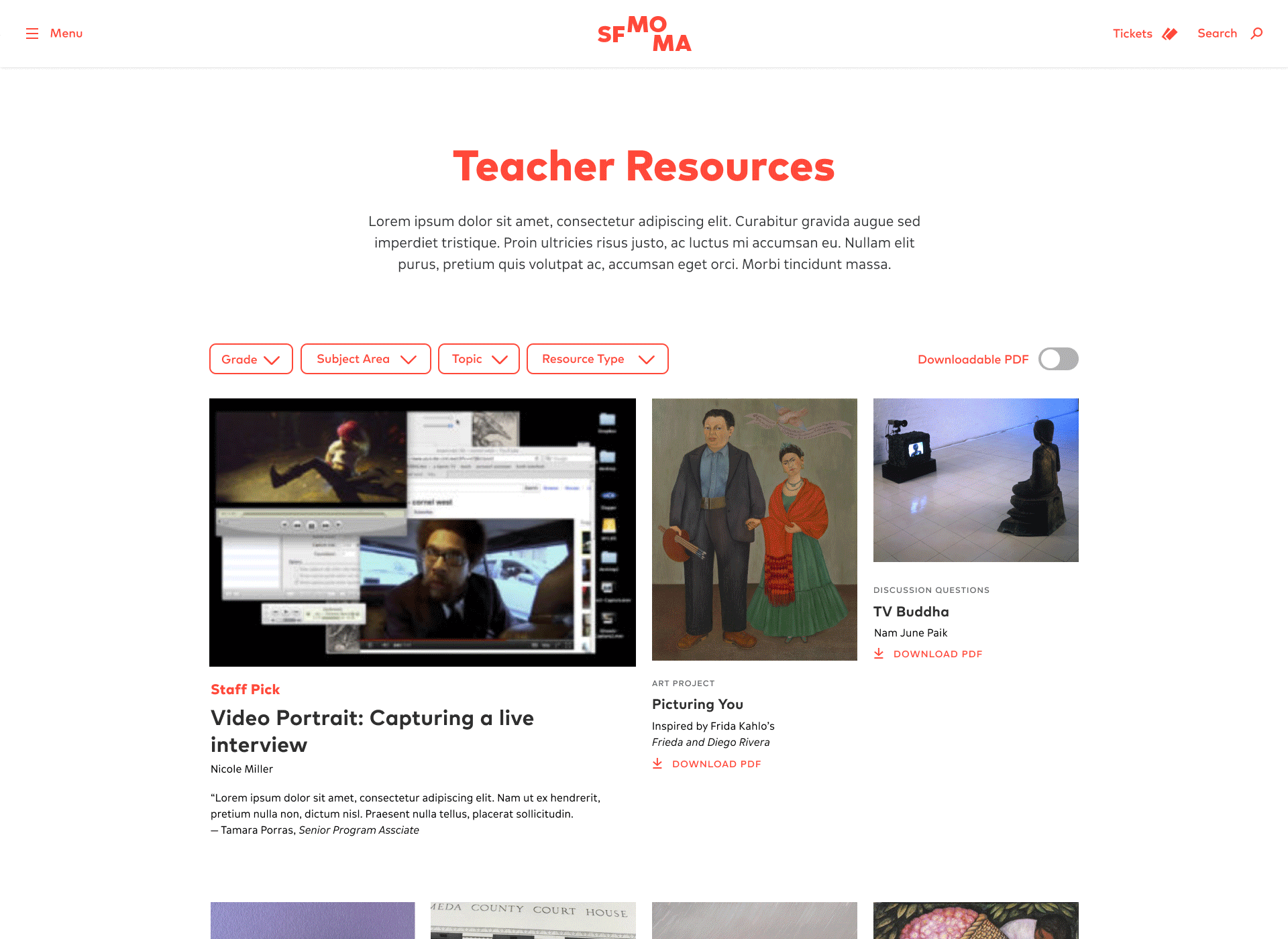
Many educators visit the Teacher Resources page on sfmoma.org to search for art resources and activities for their students. Unfortunately the old filtering system on the page was very clunky, taking up close to the entire above-the-fold space. Working very closely with the web and education teams, we conducted user tests with teachers who regularly use this page and observed how they navigate the page in order to inform our decisions for the redesign.
Creative Director: Bosco Hernandez
Visual Designer: Summer Li
UX: Janice Cho
Developer: Noah Biavaschi
Visual Designer: Summer Li
UX: Janice Cho
Developer: Noah Biavaschi
Here’s what we found:
- We needed a more compact design to display the resource categories so teachers don’t have to scroll all the way down to see the results.
- We needed this page to look more like a resources/search results page.
- We needed a way for busy teachers to quickly find resources that can be quickly downloaded to PDF.
- Are there ways we can more intuitively recategorize or rename the filters?

After the user testing, I brainstormed with the web and education teams to made quick, iterative wireframes tackling the points above. We culled through different quotes that were recorded from the usability test interviews and grouped them by action items. I then took all of ideas and action items into Figma and reworked them into the following designs.

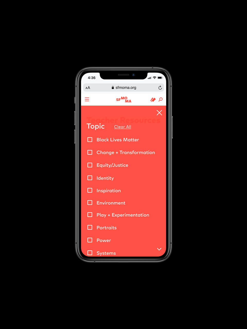
Takeover Navigation on Mobile
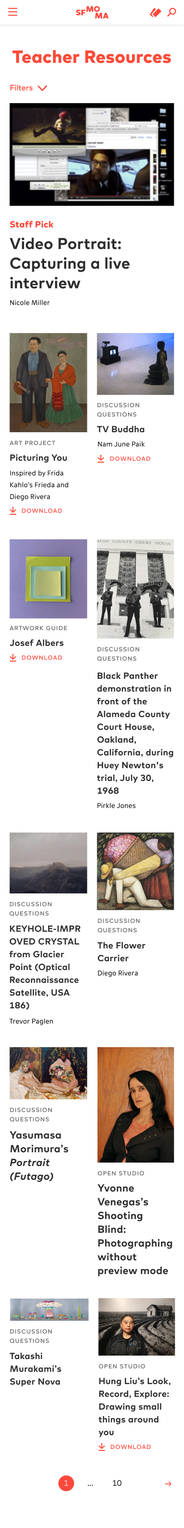
We found out that most of the teachers who use this resource page access it through desktop and tablets, sometimes very quickly before class, though we also wanted to think carefully about how to design the mobile experience so that it would be less fussy and even more efficient. For one, we removed the page description so that the results showed up immediately. Secondly, the filter navigations are collapsible and take over the full screen when activated to provide a clear, easily-navigable space on small screens. This takeover follows a similar visual language as our main site search which also appears as a warm red takeover across the screen.
We found out that most of the teachers who use this resource page access it through desktop and tablets, sometimes very quickly before class, though we also wanted to think carefully about how to design the mobile experience so that it would be less fussy and even more efficient. For one, we removed the page description so that the results showed up immediately. Secondly, the filter navigations are collapsible and take over the full screen when activated to provide a clear, easily-navigable space on small screens. This takeover follows a similar visual language as our main site search which also appears as a warm red takeover across the screen.

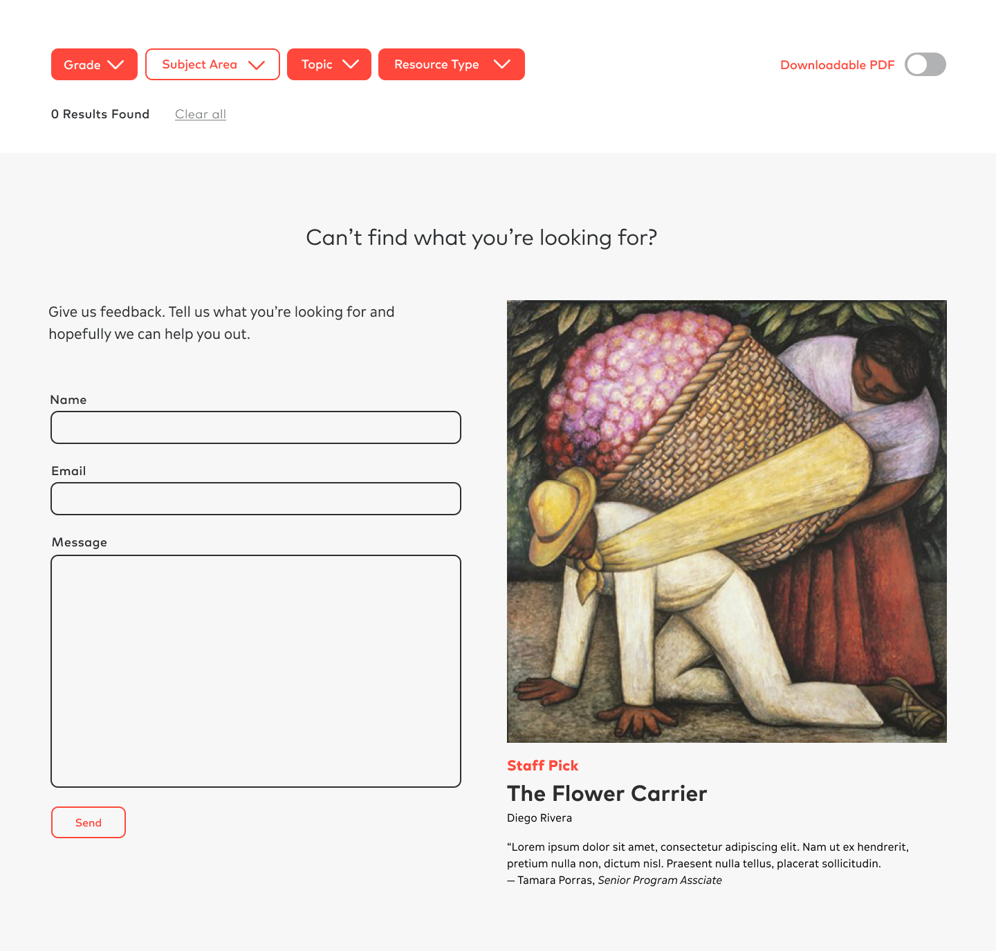
Super Specific Filtering
If for whatever reason, the user checks too many filters and is looking for something super specific that we haven’t created yet, the No Results page shows up and features a feedback form that will send a direct message to SFMOMA’s education team. There, the user can describe the resource they are looking for and it will give the museum a proper channel for feedback and ideas to create new content.
If for whatever reason, the user checks too many filters and is looking for something super specific that we haven’t created yet, the No Results page shows up and features a feedback form that will send a direct message to SFMOMA’s education team. There, the user can describe the resource they are looking for and it will give the museum a proper channel for feedback and ideas to create new content.
Unifying Templates
It’s important to think about website optimizations, especially those of a single section on the site, as a part of a system. How will the redesign of this page fit in with the rest of the site? Although we introduced new styles, we worked within our developed visual language and existing UI library.
I created the below blank templates to be our source of truth document moving forward since there have been many one-off projects throughout the website. This template has been used by newer pages such as the creation of SFMOMA Stories and will be unified throughout other parts of the site moving forward.
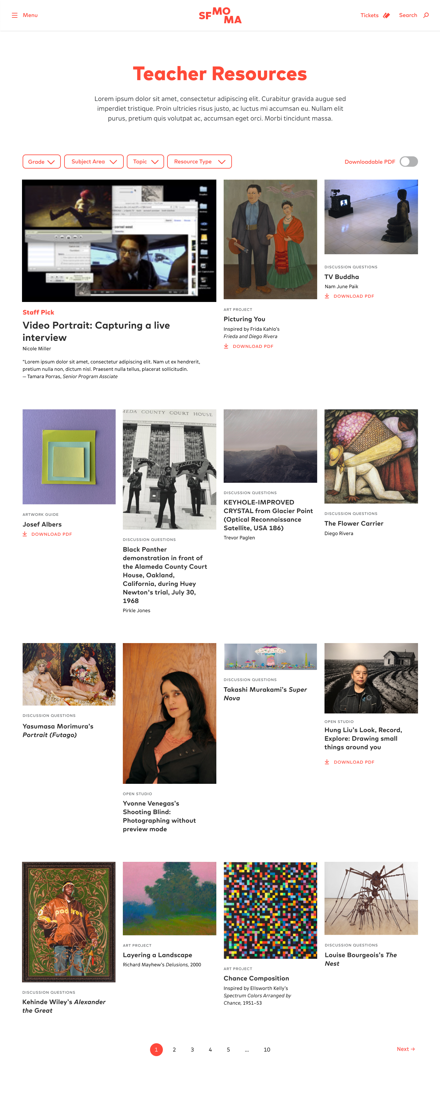
Full Landing Page Designs
Desktop
1400px
![]()
1400px
Tablet
1024px
![]()
1024px

Mobile
375px
![]()
375px
Visit the live site