Diana Markosian’s Santa Barbara
2021
Visual identity and exhibition graphics
San Francisco Museum of Modern Art
Visual identity and exhibition graphics
San Francisco Museum of Modern Art

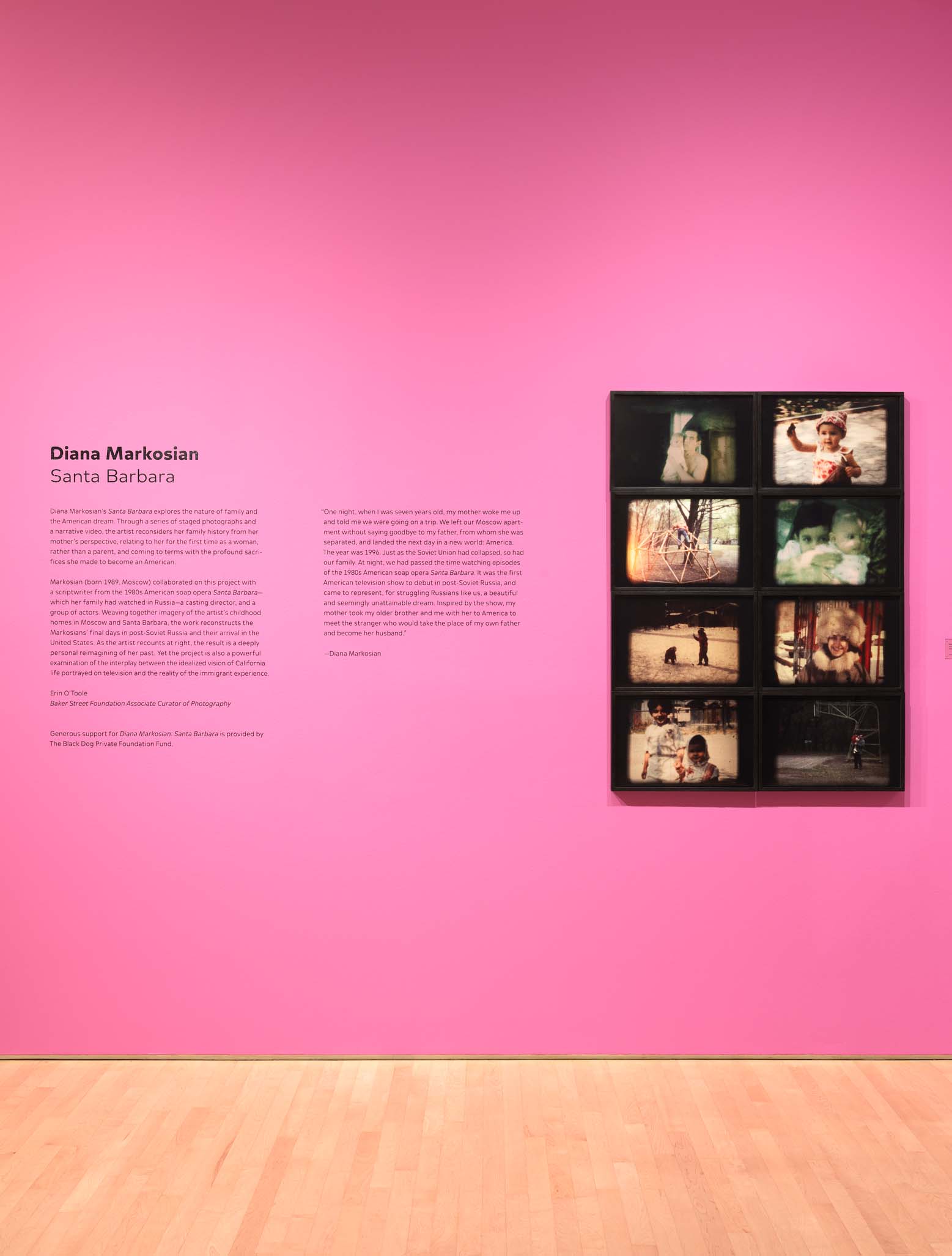
Diana Markosian’s Santa Barbara (2021) was a photography exhibition at SFMOMA. It displayed staged photographs and a video piece that told of her and her family’s story of immigrating from then-USSR Moscow to what ended up being her second childhood home, Santa Barbara.
I collaborated with the artist closely on the identity and exhibition graphics to ensure that the visuals fully evoked the nostalgia, humor, and playfulness of this very personal story.
I collaborated with the artist closely on the identity and exhibition graphics to ensure that the visuals fully evoked the nostalgia, humor, and playfulness of this very personal story.
Lead Designer: Summer Li
Exhibitions: Adalberto Charvel
Art Director: Meghan Berckes
Exhibitions: Adalberto Charvel
Art Director: Meghan Berckes


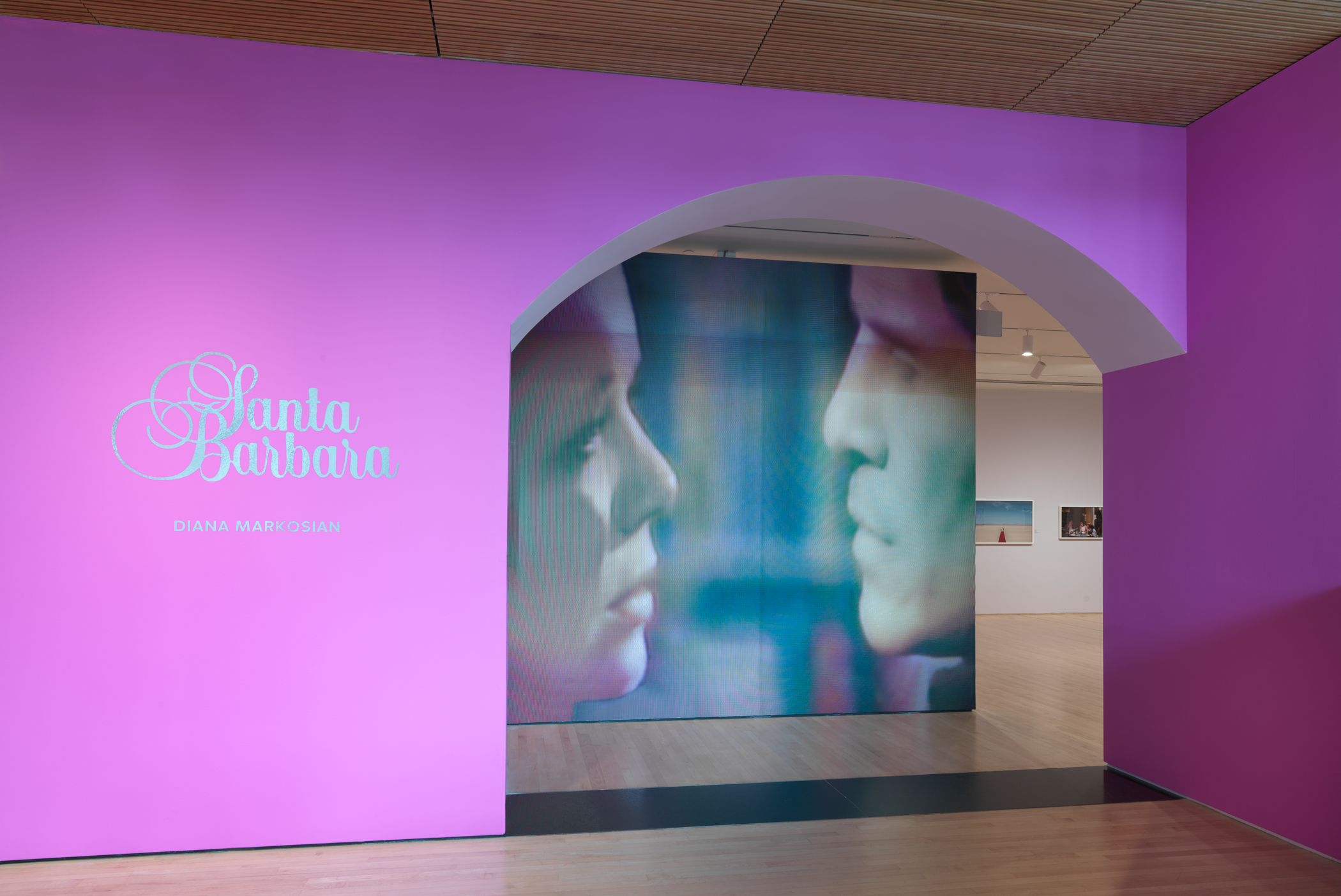
The Title and Title Wall
The title of the exhibition is a direct reference to the 1990s soap opera of the same name. The love story that is told in the photographs of the exhibition, the one between her mother and American stepdad, has a symbiotic relationship with a particular story in the soap opera.
To bridge that connection for the visitors, we reappropriated the title graphics of the tv show onto the exhibition wall and used a screencap of lovers from Santa Barbara as the main entrance graphic.


The Arch
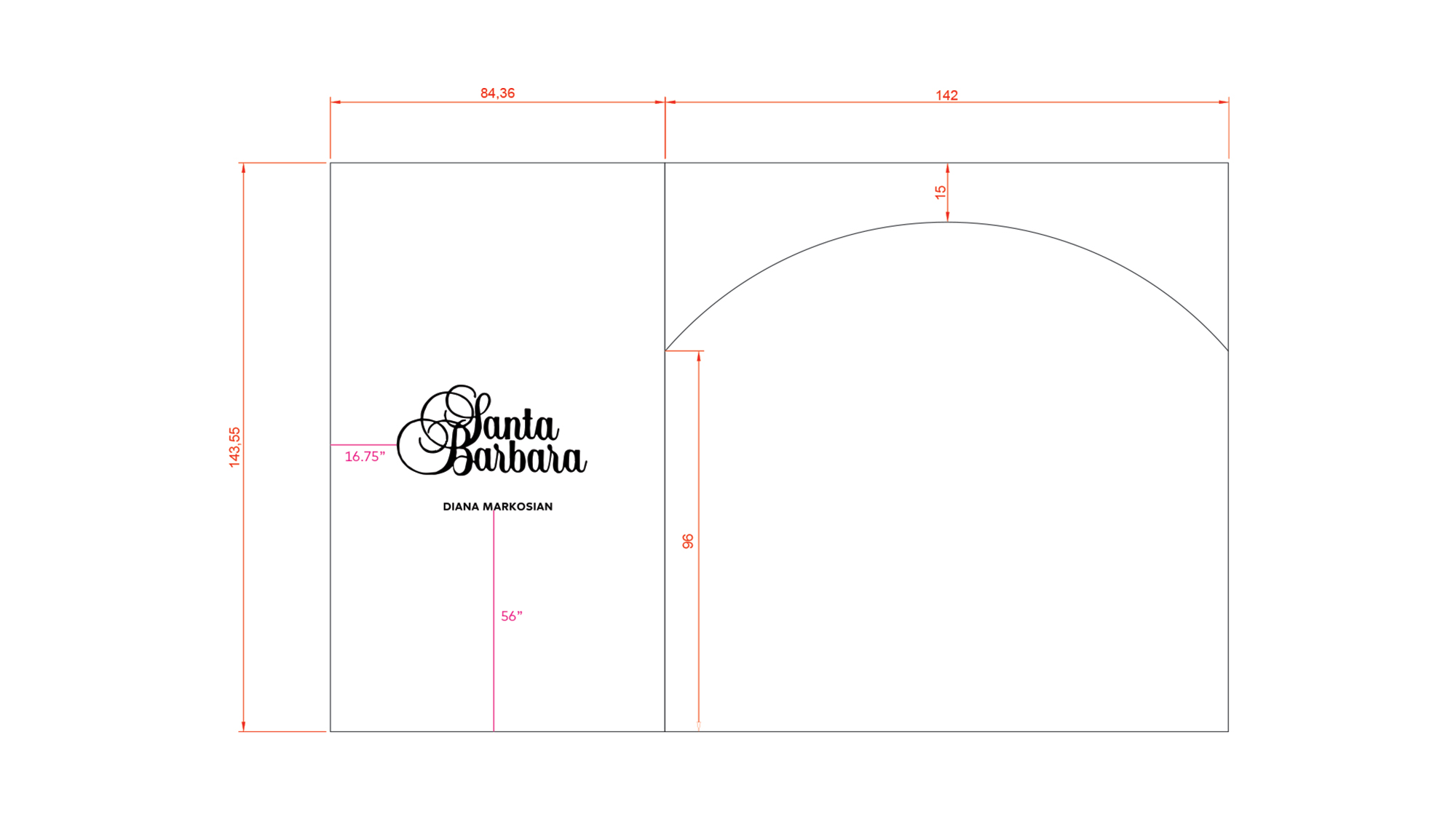
We had the idea of building an arch header at the entrance of the exhibition that extended from the left title wall. It emulates the shape of the keyhole arch that is in the title sequence of the TV soap, further bridging that connection. The arch header was such a distinct visual component that it created this immersive portal where visitors felt like they were entering into a different world.
We had the idea of building an arch header at the entrance of the exhibition that extended from the left title wall. It emulates the shape of the keyhole arch that is in the title sequence of the TV soap, further bridging that connection. The arch header was such a distinct visual component that it created this immersive portal where visitors felt like they were entering into a different world.


Paint Colors
The narrative throughout the exhibition, the love story was told through her mother’s perspective. Knowing this, we decided on more traditionally feminine colors.
We paired a bright magenta title wall with the title cut in reflective silver vinyl to achieve a more retro / 90s aesthetic that was felt in the artist’s photos. A warmer gray was chosen for the interior walls to give a sense of intimacy—almost as if you’re walking into someone’s bedroom and learning more about their secrets.